728x90
반응형
1. transform
transform은 HTML 요소에 회전, 크기 조절, 이동, 기울이기 등의 2D 또는 3D 변형 효과를 적용할 수 있는 CSS 속성입니다. 이 속성을 사용하면 요소를 원래 위치나 모양에서 벗어나 다양한 시각적 효과를 줄 수 있으며, 대표적으로 translate()(이동), rotate()(회전), scale()(확대/축소), skew()(기울이기) 함수 등이 있습니다. 예를 들어 transform: rotate(45deg);를 사용하면 요소를 45도 회전시킬 수 있습니다. 애니메이션이나 인터랙션 효과를 만들 때 자주 활용됩니다.
1. translate(x, y) – 이동하기
- 요소를 x축과 y축 방향으로 이동시킵니다.
- 단위는 px, % 등 사용할 수 있습니다.
- 원래 위치에서 얼마나 이동할지를 나타냅니다.
2. rotate(deg) – 회전하기
- 요소를 지정한 각도만큼 회전시킵니다.
- 중심점(기본적으로 요소의 중심)을 기준으로 회전합니다.
3. scale(x, y) – 확대/축소하기
- 요소의 크기를 x배, y배로 조절합니다.
- 1은 원래 크기, 2는 2배, 0.5는 절반입니다.
4. skew(x, y) – 기울이기
- 요소를 x축 또는 y축 방향으로 기울입니다.
- 기울이는 각도는 deg로 지정합니다.
<!DOCTYPE html>
<html lang="ko">
  <head>
    <meta charset="UTF-8" />
    <meta name="viewport" content="width=device-width, initial-scale=1.0" />
    <title>transform 개별 적용 예제</title>
    <style>
      body {
        font-family: sans-serif;
        text-align: center;
        padding: 20px;
      }

      .container {
        display: flex;
        flex-wrap: wrap;
        justify-content: center;
        gap: 30px;
        margin-top: 30px;
      }

      .box {
        width: 100px;
        height: 100px;
        background-color: skyblue;
        transition: transform 0.4s ease;
        display: flex;
        align-items: center;
        justify-content: center;
        font-weight: bold;
        color: white;
        border-radius: 10px;
      }

      .box:hover {
        cursor: pointer;
      }

      /* 각 도형에 다른 transform 효과 적용 */
      .translate:hover {
        transform: translate(40px, 20px);
      }

      .rotate:hover {
        transform: rotate(45deg);
      }

      .scale:hover {
        transform: scale(1.5);
      }

      .skew:hover {
        transform: skew(20deg, 10deg);
      }
    </style>
  </head>
  <body>
    <h2>각 도형에 다른 transform 효과 적용</h2>
    <p>마우스를 각 도형에 올려보세요!</p>

    <div class="container">
      <div class="box translate">translate</div>
      <div class="box rotate">rotate</div>
      <div class="box scale">scale</div>
      <div class="box skew">skew</div>
    </div>
  </body>
</html>
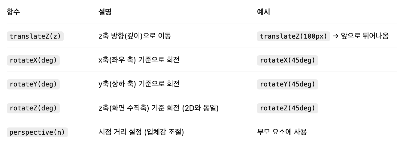
주요 3D Transform 함수
<!DOCTYPE html>
<html lang="ko">
  <head>
    <meta charset="UTF-8" />
    <meta name="viewport" content="width=device-width, initial-scale=1.0" />
    <title>회전하는 3D 큐브</title>
    <style>
      body {
        background-color: #111;
        color: white;
        font-family: sans-serif;
        text-align: center;
        padding-top: 50px;
      }

      .scene {
        width: 200px;
        height: 200px;
        margin: 0 auto;
        perspective: 800px; /* 시점 거리 */
      }

      .cube {
        width: 100%;
        height: 100%;
        position: relative;
        transform-style: preserve-3d;
        transform: rotateX(-20deg) rotateY(-20deg);
        transition: transform 3s ease-in-out; /* 천천히 부드럽게 회전 */
      }

      .scene:hover .cube {
        transform: rotateX(360deg) rotateY(360deg);
      }

      .face {
        position: absolute;
        width: 200px;
        height: 200px;
        background: rgba(0, 150, 255, 0.8);
        border: 2px solid white;
        box-shadow: 0 0 20px rgba(0, 0, 0, 0.5);
        line-height: 200px;
        font-size: 24px;
        font-weight: bold;
        color: white;
      }

      .front {
        transform: rotateY(0deg) translateZ(100px);
      }
      .back {
        transform: rotateY(180deg) translateZ(100px);
      }
      .right {
        transform: rotateY(90deg) translateZ(100px);
      }
      .left {
        transform: rotateY(-90deg) translateZ(100px);
      }
      .top {
        transform: rotateX(90deg) translateZ(100px);
      }
      .bottom {
        transform: rotateX(-90deg) translateZ(100px);
      }
    </style>
  </head>
  <body>
    <h2>🧊 느리게 회전하는 3D 큐브</h2>
    <p>마우스를 올려보세요!</p>

    <div class="scene">
      <div class="cube">
        <div class="face front">앞</div>
        <div class="face back">뒤</div>
        <div class="face right">오른쪽</div>
        <div class="face left">왼쪽</div>
        <div class="face top">위</div>
        <div class="face bottom">아래</div>
      </div>
    </div>
  </body>
</html>
2. transition
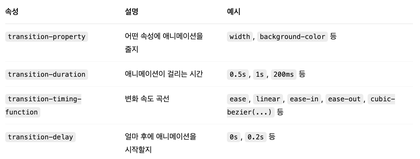
transition은 CSS 속성의 값이 바뀔 때 변화가 즉시 일어나지 않고, 부드럽게 애니메이션되도록 만들어주는 속성입니다. 예를 들어 버튼에 마우스를 올렸을 때 배경색이 천천히 바뀌게 하거나, 크기가 서서히 커지게 만들 수 있습니다. 기본 문법은 transition: 속성 지속시간; 형태이며, 예를 들어 transition: background-color 0.3s;라고 하면 배경색이 0.3초 동안 부드럽게 변경됩니다. transition-property, transition-duration, transition-timing-function, transition-delay 등을 세부적으로 지정하여 더 정교한 효과도 만들 수 있습니다.
transition: 속성명 지속시간 [타이밍함수] [지연시간];
주요 구성요소 설명
<!DOCTYPE html>
<html lang="ko">
  <head>
    <meta charset="UTF-8" />
    <meta name="viewport" content="width=device-width, initial-scale=1.0" />
    <title>transform 개별 적용 예제</title>
    <style>
      .btn {
        background-color: steelblue;
        color: white;
        padding: 10px 20px;
        transition: background-color 0.4s, transform 0.3s ease;
      }

      .btn:hover {
        background-color: tomato;
        transform: scale(1.1);
      }
    </style>
  </head>
  <body>
    <button class="btn">마우스를 올려보세요</button>
  </body>
</html>
<!DOCTYPE html>
<html lang="en">
<head>
    <meta charset="UTF-8">
    <meta name="viewport" content="width=device-width, initial-scale=1.0">
    <title>transition 활용</title>
    <style>
        #ex {
            position: relative;
            width: 800px;
            height: 400px;
            margin: 0 auto;
            border: 5px solid black;
            padding: 30px;
        }
        p {
            text-align: center;
            padding-top: 50px;
            font-weight: bold;
        }
        .box {
            font-size: 20px;
            position: relative;
            width: 140px;
            height: 140px;
            margin-bottom: 50px;
            background-color: gold;
        }

        #ex:hover > .box {
            transform: rotate(720deg);
            margin-left: 650px;
        }
        #no-delay { transition-duration: 3s;}
        #delay { transition-delay: 1s; transition-duration: 2s;}
    </style>
</head>
<body>
    <div id="ex">
        <div id="no-delay" class="box">
            <p>(●'◡'●)</p>
        </div>
        <div id="delay" class="box">
            <p>(⊙_⊙;)</p>
        </div>
    </div>
</body>
</html>
728x90
반응형